The Raw Data Sheets: Quantifying My Life One Day at a Time
📊 The Raw Data Sheets: Quantifying My Life One Day at a Time
This is my bread and butter spreadsheet, the one I open every single day without fail. My pride and joy, my life’s work. It’s the heart of LifeLoggerz: a living document in Google Sheets that quietly turns days into data, data into trends, and trends into understanding. Ironically, building all of these sheets is the one thing that I didn’t track timewise. Hundreds of hours have gone into the structure of my sheets. However, filling this in every day only takes a few minutes.
🌱 How It All Began
In 2022, I was simply writing daily diary logs.
They captured my thoughts well, but they didn’t quantify anything.
So in 2023, I decided to bring structure into the mix.
🗓 2023: The Barebones Beginning
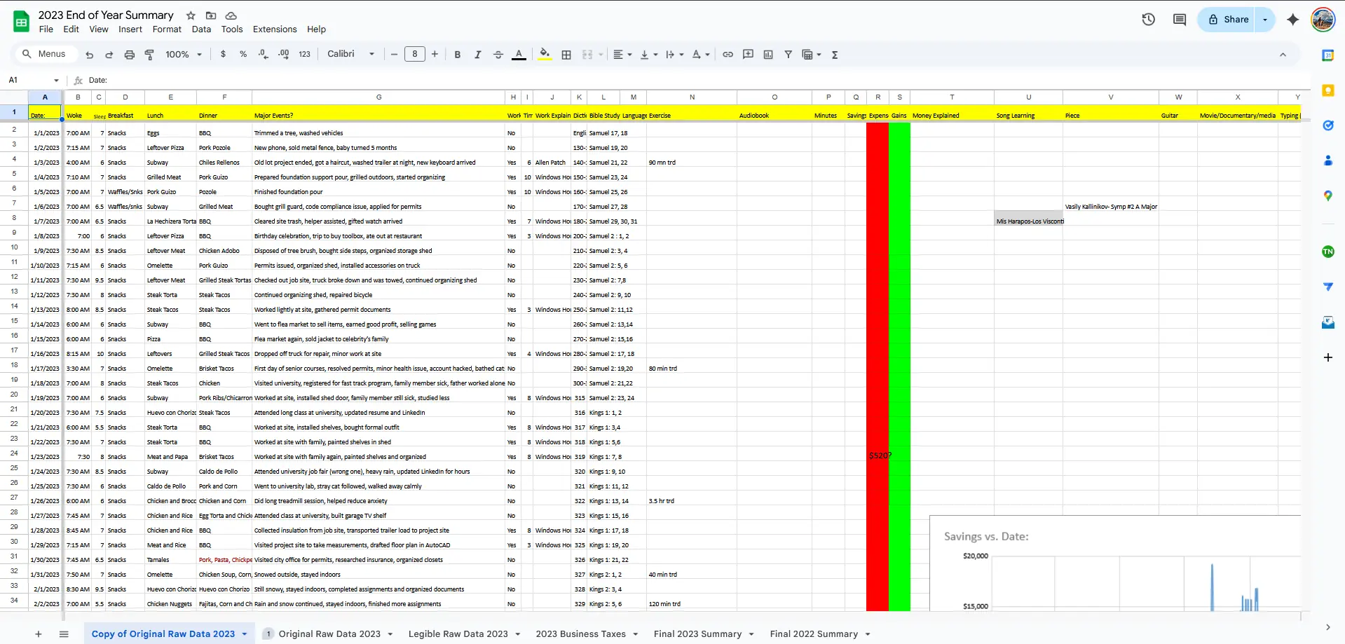
Back then, my tracking consisted of six metrics all on just one sheet:
- Sleep: Wake Up Time, Hours Slept
- Food: Breakfast, Lunch, Dinner
- Summary of the Day: short phrase with day’s most important events
No fancy formatting, more stats came later (the ones to the right).
💡 2024: The Awakening
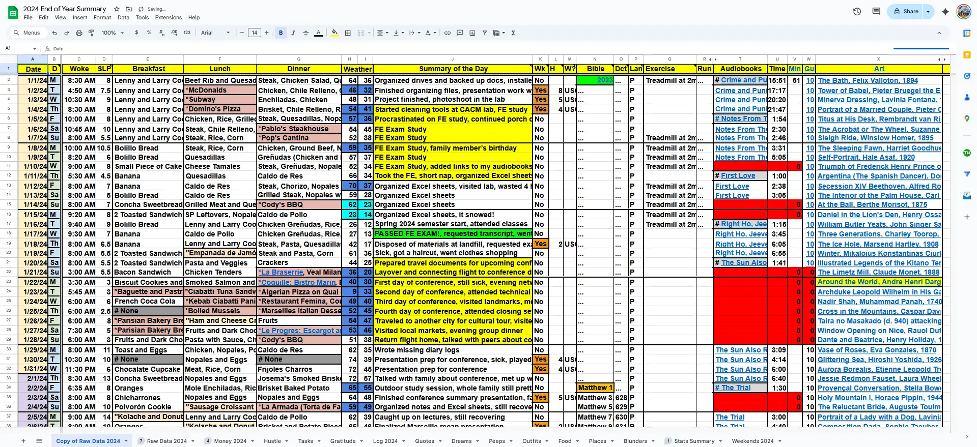
By 2024, I discovered that my diary logs contained valuable quantifiable patterns.
Why keep them hidden in text when I could visualize them?
I expanded my spreadsheet, each part of my daily life got its own tab (shown in depth below).
📈 2024: The First Graphs
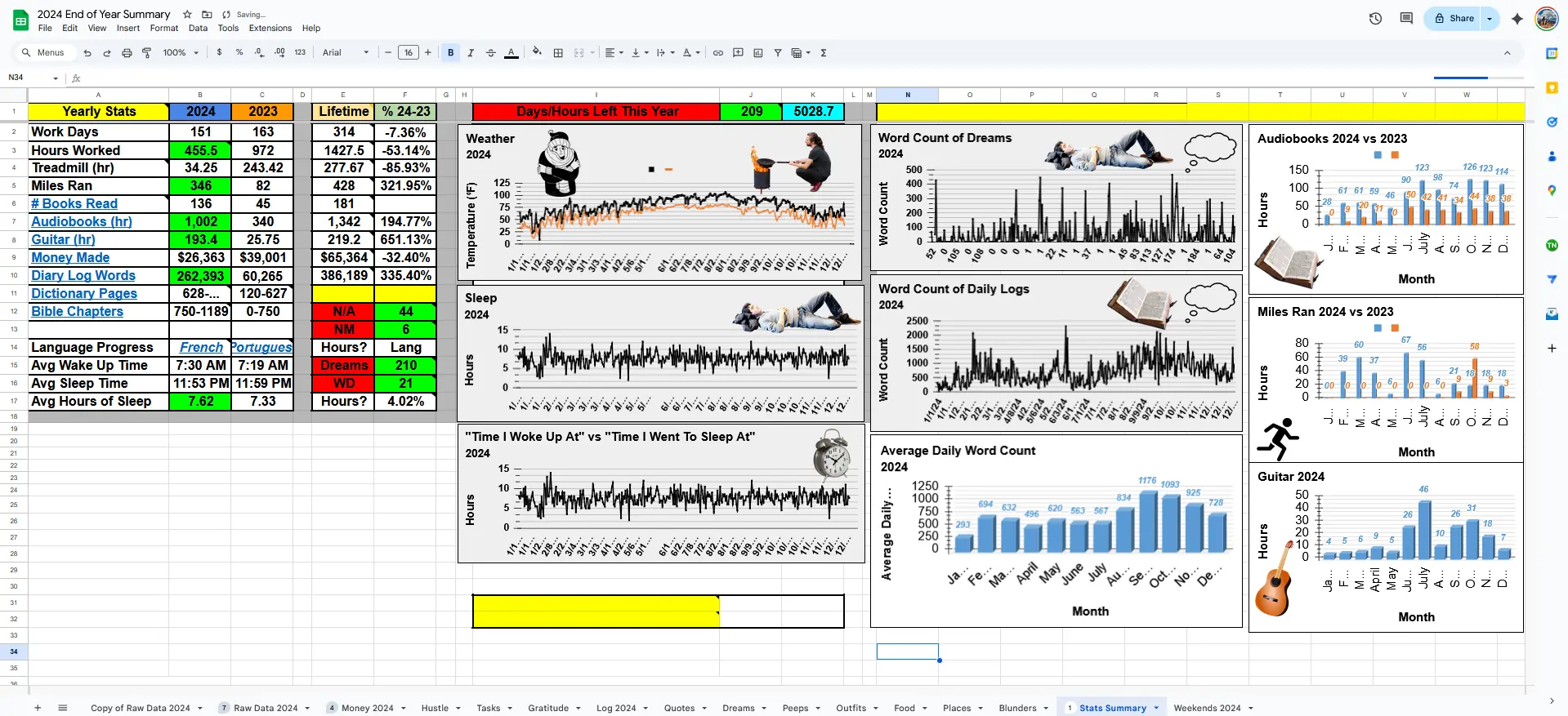
This was the first time I saw my life in charts thanks to all the data I was collecting. Suddenly, I could see when I was most productive, most social, or most consistent.
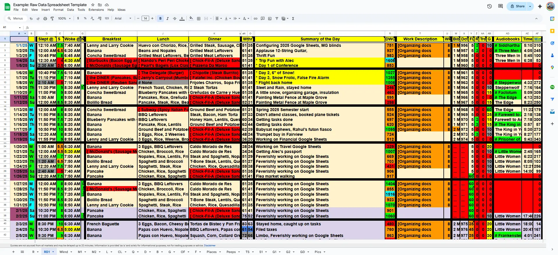
🚀 2025: The Refined System
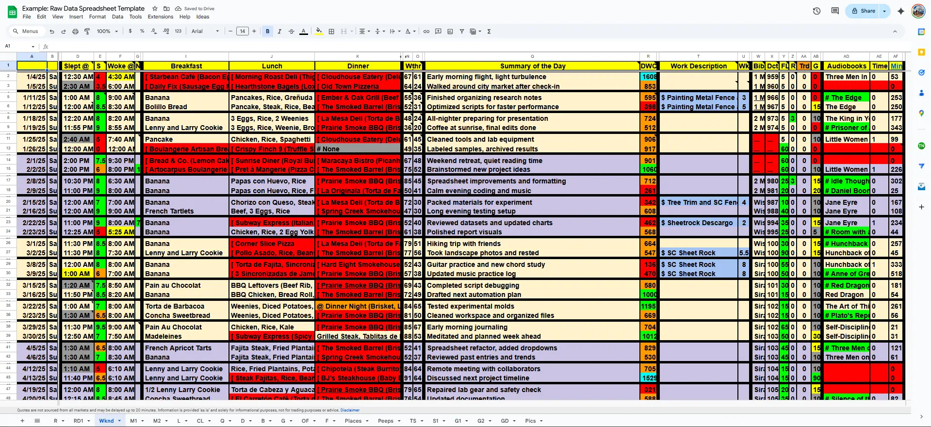
By 2025, I had everything I needed to run full-scale analytics on my life. The only thing missing was the knowledge of conditional formattting, Google App Scripts, and advanced formulas to simplify/automate laborious tasks. For instance, alternating weeks are different colors, and weekends are maroon. Alternating months are different colors (yellow for odd months, purple for even months). With code scripts, I can automate tasks like bringing in my daily image from Google Drive, or condensing my diary logs with ChatGPT API.
If you want to know everything that I track just on this one sheet: Sleep, Meals, Weather, Summary of Day, Work, Hobbies, Audiobooks
- Column D: Time I Went to Sleep at
- Column E: Hours Slept
- Column F: Time I Woke up at
- Column G: Naps
- Column I: Breakfast
- Column J: Lunch
- Column K: Dinner
- Column N: Temperature Highs
- Column O: Temperature Lows
- Column Q: Summary of Day
- Column R - Diary Log Word Count
- Column T - Work Description
- Column U - Hours Worked
- Column W - Religious Study
- Column X - Dictionary Page
- Column Y - Language Study
- Column Z - Running (Miles)
- Column AA - Treadmill (Minutes at 2mph)
- Column AB - Guitar
- Columns AD, AE, AF: Audiobooks (timestamp, min)
Notice how there’s colors everywhere? Conditional formatting does that work for me. I use symbols like [, @, ”, *, $, #, and these paint the cells automatically. These colors mean different things, and they’re incredibly useful for spotting patterns. Grey in the Sleep section means that I stayed up past 1am. Baby blue in the Weather section means it snowed, red means it was over 100 degrees F. Green in the Audiobooks section represents a new audiobook. And so on, and so on. These sheets have data on top of data!
Anyway, let’s move on.
Check out the individual sheets below, the “organs” that make up this living system.
🧩 The Individual Sheets
Each sheet focuses on one aspect of daily life, working in harmony to build a full picture.
These are all part of the Raw Data workbook, the foundation of everything else.
💰 Money
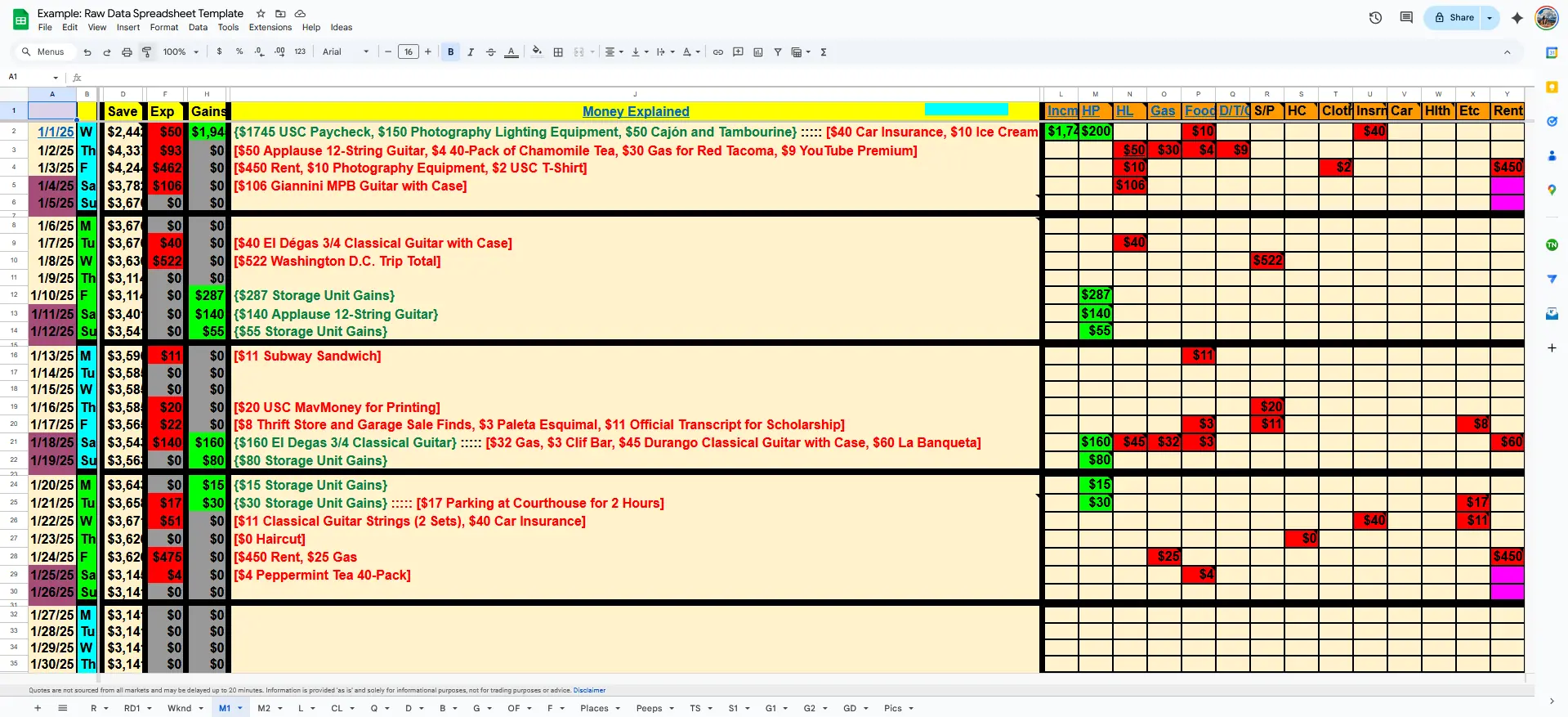
Money tells stories: of priorities, habits, and decisions.
This sheet shows what I spend on, what I invest in, etc.
📜 Logs (Complete)
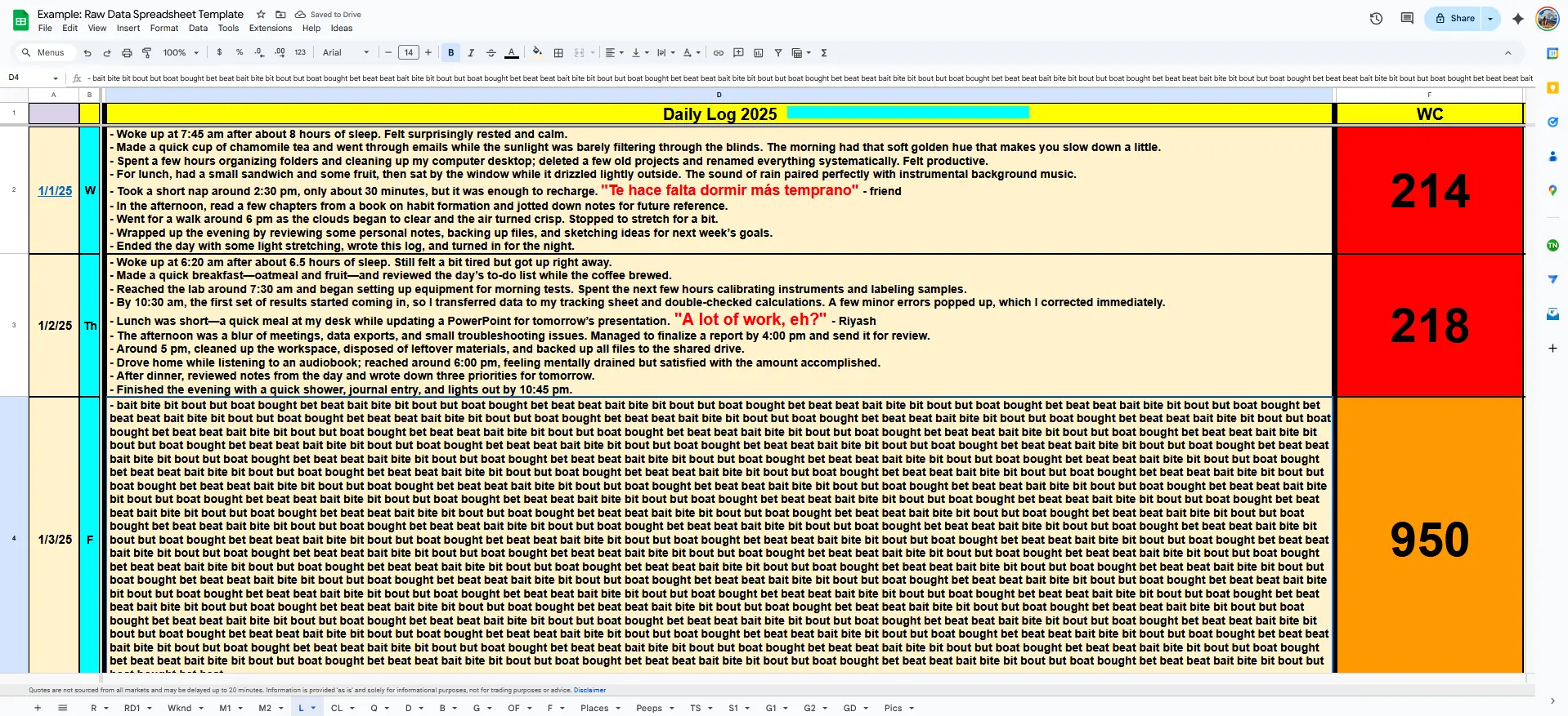
This is where raw reflection lives. Every event, every thought, every memory. I write my log in Obsidian and then copy-paste it here. This system allows you to see diary logs next to each other, and Ctrl+F is much easier here than in Obsidian or other apps. Feels great to go back to these after a while and relive each day.
⚙️ Logs (Condensed)

Google Apps Script + ChatGPT API (explained in future blog post) automatically compress the daily logs into summaries for morning, afternoon, and evening. If I need to quickly get the general layout of a day’s events, this is much easier to navigate than the Complete Logs sheet.
💬 Quotes
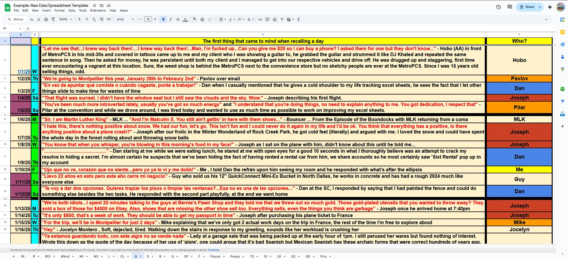
At the end of each day, I write down the first thing that I recall someone saying. Whatever I found most remarkable, funniest, most critical, etc. These quotes (and the context provided) help you to plant yourself in that distant memory and relive it.
💥 Blunders
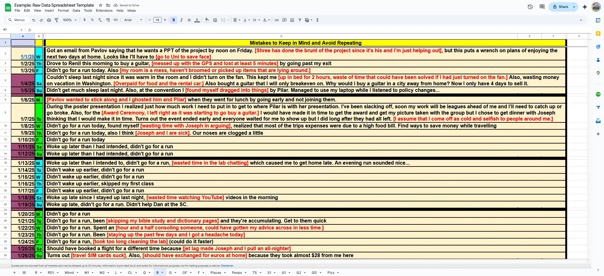
Most days have small ones like ‘I woke up late’. When you’ve seen this 70 times, you eventually decide to do something about it. As for big blunders, I needn’t say more.
👕 Outfits
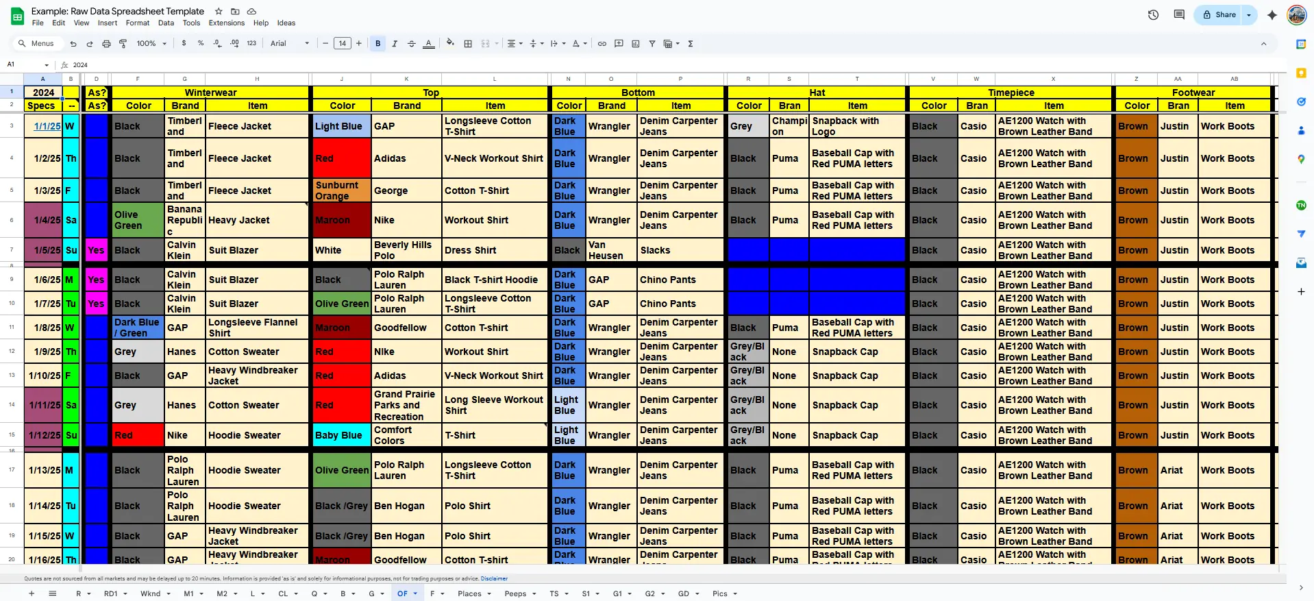
It’s not vanity; it’s curiosity. In my case, I dress simply, so this helps me to see when I intentionally stand out.
Patterns emerge: color preferences, weather adaptation, and changes in taste.
I still remember the day I switched from regular cut jeans to carpenter jeans. Very roomy. And that day is reflected here too.
Scientific, isn’t it?
🍽 Food
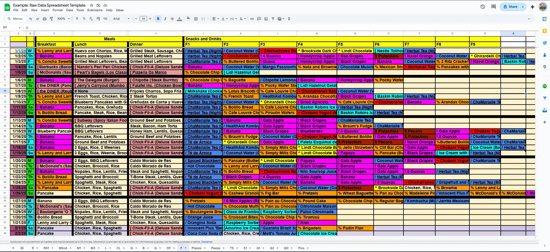
Trends in diet reveal much about discipline and mood. I don’t track calories, but feel free to add to these sheets. Stomach aching? Eating too much ice cream? Much easier to pinpoint the culprits here.
📍 Places
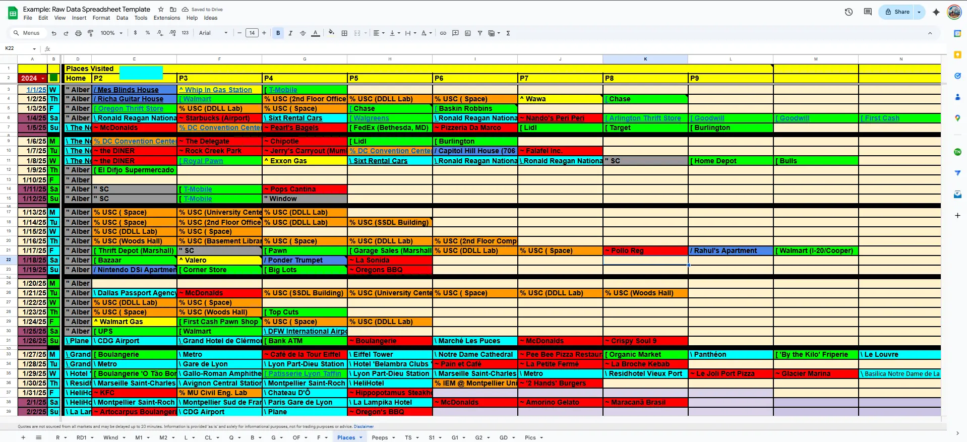
Each cell is a breadcrumb of geography.
Over time, it shows whether I’ve become more exploratory or more homebound.
🧑🤝🧑 People

This sheet catalogs every person that I interacted with on any given day. “When’s the last time I saw ‘xx’?”. Here’s your answer.
📊 Advanced Visuals & Dashboards
The next layer of the system uses formulas to visualize patterns across weeks, months, and categories.
These advanced sheets transform data into insight (and beauty).
🧮 Money Dashboard
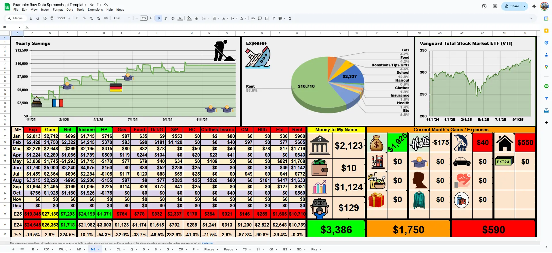
This “Money Dashboard” connects with the financial log, showing total expenses and earnings. Want to know how much you spent on Gas in the month of July 2025? How about Donations in December?
🎈 Weekend Sheet
This draws data from the Raw Data sheet, showing us only the weekends. Find yourself binging Netflix instead of going out? Here’s the solution.
📉 Graphs I
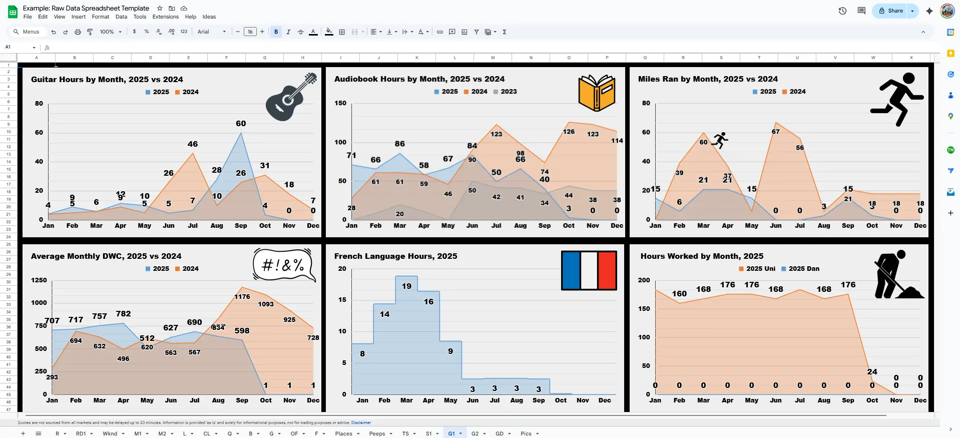
And with all the data and stats we’ve covered, doesn’t it feel great to see it all in one place?
📈 Graphs II
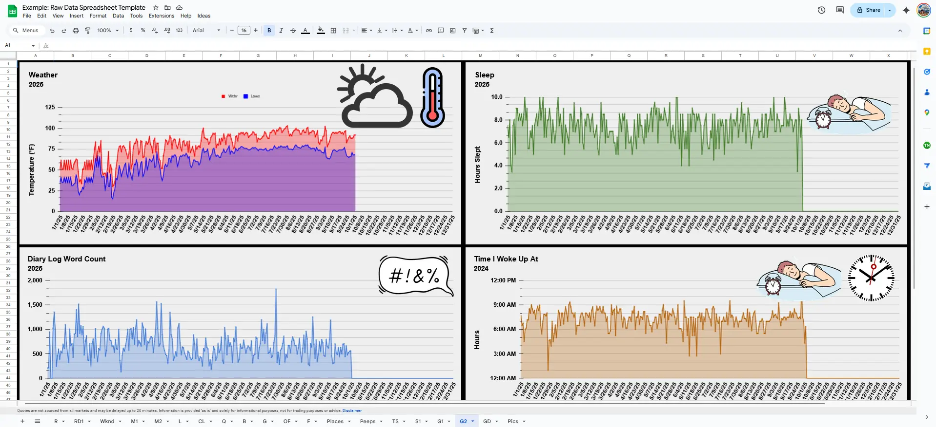
And how!
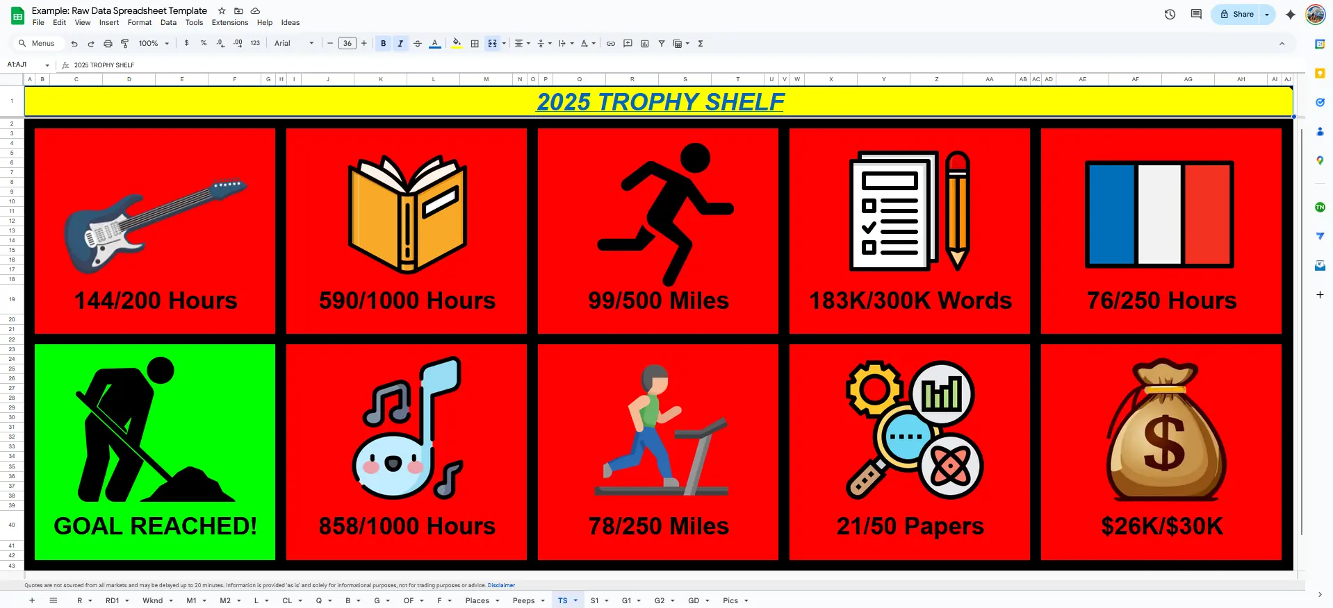
🏆 Trophy Shelf
🧠 Final Thoughts
There’s much more here than meets the eye.
Behind these sheets run Google Apps Scripts that automate summaries, manage file imports, and communicate with ChatGPT’s API to create condensed diary entries automatically.
Each post in this series will uncover a new part of that system, how automation and design turn everyday life into an evolving dataset.
“A spreadsheet may seem lifeless, but fill it with your days and it becomes your autobiography”
- LifeLoggerz