From Dollars to Decisions — How I Track My Entire Financial Life in Google Sheets 💵📊
While LifeLoggerz began as a habit-tracking project, one of the most powerful parts of the system became my financial tracker. This Google Sheets setup shows exactly where my money goes, how much I save, and what my spending says about my decisions.
This blog post breaks down the system you see in my screenshots: the yearly savings chart, category breakdowns, month-by-month tables, and the raw data sheet where every expense is tagged and explained.
If you want to build something similar, you can copy parts or adapt the whole thing.
Why track finances this way? (Short version)
- Money tells the truth — about priorities, habits, and discipline.
- Budgeting apps never gave me the level of detail I needed.
- Google Sheets lets me build exactly what I want:
formulas, colors, categories, dashboards, and automation.
I treat money like data. When it’s visualized clearly, the stress disappears and the progress becomes obvious.
How my financial tracker evolved (V1 → V3)
| Year | Version | Big changes |
|---|---|---|
| 2023 | V1 | Simple income–expense table, manual monthly totals |
| 2024 | V2 | Added categories, formulas, color-coding, savings tracking |
| 2025 | V3 | Full dashboard: savings graph, expense pie chart, category insights, automated monthly rollups |
(I’ll add screenshots in the gallery — you can literally see the glow-up.)
What I track (the financial version)
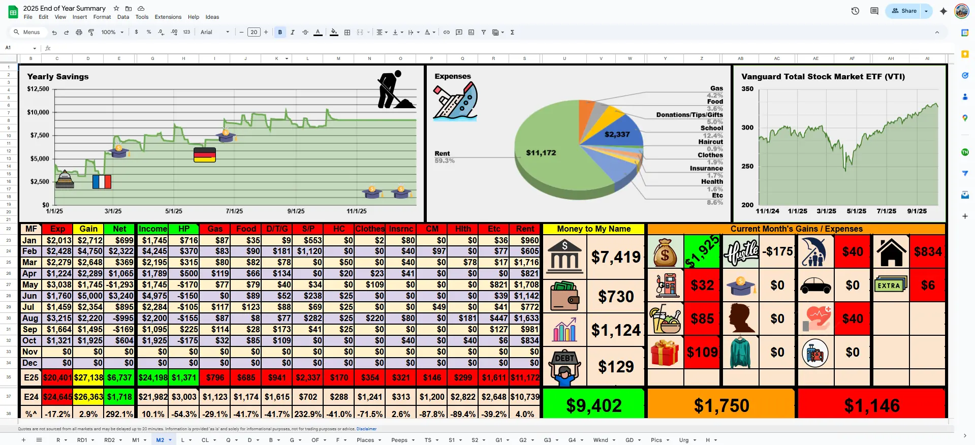
Here’s the overview visible in my dashboard:
1. Income
- Paychecks
- Side hustles
- Gifts, scholarships, grants
2. Expenses
Every dollar gets a home in a category:
- HP (Health Products)
- Gas
- Food
- Donations/Tips/Gifts
- Self/Personal (S/P)
- Haircut
- Clothes
- Insurance
- Car
- Health
- Rent
- Misc
Your sheet may look different — mine reflects my life as a student, researcher, and someone who lives simply on purpose.
3. Savings
- Daily running balance
- Monthly net gains
- Year-to-date total
- A large visual graph showing swings and discipline
4. Money Explained (Raw Data)
The raw data sheet is where each line item is broken down into:
- What I spent
- Why I spent it
- Color-coded categories
- Daily savings snapshot
- Income recorded individually
- Gains (like selling old items or storage unit finds)
It acts like a diary — but in dollars.
The real benefit: money becomes a mirror
After three years of maintaining this system, here’s what I learned:
🔍 1. Financial patterns become obvious
You quickly see:
- which categories dominate your spending
- which months spike
- and how consistent (or inconsistent) your savings habits are
📊 2. Monthly dashboards motivate consistency
When your savings line visibly rises each week, you want to keep the slope green.
💵 3. Zero guilt, maximum clarity
Tracking money removes uncertainty.
If I overspend, I see it.
If I’m disciplined, the chart rewards me.
🛠 4. Easy to update (1–5 minutes per day)
Because the system is:
- color-coded
- category locked
- formula-powered
I log expenses quickly and painlessly.
How the system works (quick explanation)
1. Raw Data Sheet — the engine
You type:
- the date
- the money explained (e.g., “$20 gas, $11 subway sandwich”)
- the amount (green for gains, red for expenses)
- the category in its column
Everything else is automated.
2. Monthly Rollup — the logic
Formulas calculate:
- income
- expenses
- net
- category totals
- % changes compared to last year
3. Dashboard — the story
The top sheet visually displays:
- the Yearly Savings Graph
- the Expenses Pie Chart
- a Vanguard Investment Tracker
- and the Current Month Tile View of each category
It becomes your financial “homepage.”
Roadmap — what’s next for my financial tracker
- Add a year-over-year comparison dashboard
- Integrate Google Finance API for investment widgets